

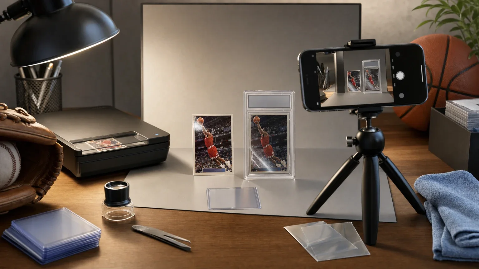
A strong sports card photo is not just about making a card look good. It has a second job: showing what is really there. That means the image should reveal centering, corners, edges, and surface while still making the card easy to identify at a glance.
For collectors who are listing cards, trading with another hobbyist, or preparing submission photos, the goal is the same. Use lighting that shows detail, avoid glare, keep the full perimeter visible, and include the back when condition matters. PSA’s imaging guidance and grading standards both point to the same basic idea: a good photo should clarify, not disguise.
That is especially important with glossy, foil, or chrome stock, where a bad angle can hide scratches or create reflections that flatten out the card’s true look. It is also why there is no single perfect setup for every card. A scanner can work well for many flat cards, while a phone photo may be better when reflectivity, thickness, or a slabbed holder makes scanning less practical.
If you are deciding how to present a card honestly, it helps to think less about taking a beautiful picture and more about taking an informative one. That distinction matters whether you are showing a raw card, a slab, or a card you simply want documented in your collection. If you want a broader collecting context for when photo quality matters most, our guide to Graded vs. Raw Sports Cards: Which Fits Your Collection? is a useful companion piece.
What should a sports card photo accomplish first?
The first job of any sports card photo is identification. Someone viewing the image should be able to tell what card it is without guessing at the team, player, year, or back design. The second job is more important for honesty: the photo should reveal the card’s condition as clearly as possible, not just its front-facing appeal.
That means the picture should show the card’s borders, corners, and surface enough to make obvious wear visible. PSA’s imaging advice emphasizes filling the frame, using good light, avoiding flash, and showing both sides. Its grading standards also make clear that centering, corners, edges, and surface are core condition factors.
A helpful rule is simple: if the image makes the card easy to admire but hard to evaluate, it is not doing the job well enough. A good card photo should help another collector understand what they are seeing without needing to hold the card in hand.
- Make the card instantly identifiable.
- Reveal the full perimeter and surface, not just the image area.
- Use the photo to inform condition judgment, not to improve the card’s appearance.
- Treat the front and back as part of the same record when condition matters.
What lighting works best without hiding wear?
Lighting is the foundation of a clear card photo. PSA’s guidance says dark photos will not show details, while flash can distort true color and create glare. In practice, the best light is usually soft and even rather than bright and direct. You want enough illumination to expose small flaws, but not so much that reflections wash out the surface.
This is where many collectors make a mistake: they aim for a dramatic, high-contrast look that seems sharp on a phone screen but actually hides the things graders and buyers care about. Surface scratches, print spots, and slight bends are easier to see when the light is balanced across the card instead of concentrated in one bright hotspot.
A good test is to tilt the card slightly and watch what happens to the reflections. If a small movement makes the entire card flash out, the light is too harsh or too direct. If the surface looks flat and lifeless, you may need a little more light from a different angle rather than stronger light from the same angle.
- Prefer soft, even light over harsh direct light.
- Turn flash off when you want true color and fewer reflections.
- Watch for hotspots that hide scuffs or print defects.
- Retake images when the card looks cleaner than it does in hand.
Which background makes borders and corners easier to judge?
The background should help the card stand out, not compete with it. PSA recommends a black cloth or a neutral background that contrasts with the card border. For scans, PSA also recommends placing the card against a black background. That choice is practical, not decorative: contrast makes edges, whitening, and corner wear easier to see.
A busy table, patterned mat, or textured desk surface can make a card look tidy while distracting from the details that matter most. If the border blends into the setting, it becomes harder to evaluate centering, fraying, or miscut edges. That is especially true with cards that have thin borders or dark borders of their own.
There is no universal background that works best for every design. Black is often strong for white-bordered cards, while a neutral background can be more useful when a card is already very dark. The right choice is the one that keeps the perimeter readable without introducing visual noise.
- Use contrast to separate the card from the background.
- Avoid patterned surfaces that distract from small flaws.
- Choose black when light borders need definition.
- Use a neutral backdrop if black reduces readability on a dark design.
How close should you frame the card?
Fill the frame, but do not crop away evidence. PSA advises filling the frame with the card and avoiding zoom because zoom can add noise. It also says all corners should be visible in scans. That is a useful reminder that a tight image can look polished while quietly omitting the very defects a buyer wants to see.
If the photo is for a collection gallery, you may not need much extra space around the card. But if the card is being sold, traded, or compared for grading purposes, the edges and corners should remain fully visible. Leaving a little margin around the card helps confirm whether the cut looks even and whether any corner is softened or damaged.
A close crop is only honest if it still leaves the full perimeter readable. If you cannot see the corners clearly, the image is too tight for condition disclosure. In other words, the goal is not to create the most dramatic close-up, but the most useful one.
- Keep all four corners visible whenever condition matters.
- Avoid digital zoom if moving closer is an option.
- Leave enough margin to show edge wear and centering.
- Use tighter framing only when the full perimeter still remains legible.
Should you use a scanner or a phone camera?
PSA recommends a scanner, but it also says a smartphone photo can be quick and easy. The best choice depends on the card and the purpose. Scanners can be excellent for flat cards because they create a consistent, even presentation that often makes centering and borders easy to inspect. A phone, however, is more flexible when the card is reflective, thick, or in a holder that does not scan cleanly.
The limitations matter. A scanner is not always ideal for foil or chrome cards because the flat light can still create unwanted glare, and some holders or sleeves can introduce reflections of their own. A phone camera lets you shift angle, adjust distance, and test multiple positions until the surface reads more truthfully.
There is no one-size-fits-all answer in the source material, and that is important. The safest interpretation is that both tools are acceptable, but the card type should determine which one shows the truth more clearly. That is an inference from PSA’s guidance, not a hard rule from every product or every setup.
- Use a scanner for many flat, standard cards when even presentation matters.
- Use a phone for reflective stock, thick cards, or tricky holders.
- Choose the method that reveals flaws most honestly.
- Do not assume one device works best for every card type.
Why are multiple angles worth the extra time?
A single front-facing shot often misses the details that matter most. PSA’s app guidance says to angle the shot to reduce glare, and its broader imaging advice encourages multiple shots. That matters because a card can look excellent in one position and reveal scratches, scuffs, or edge wear in another.
Multiple angles are especially useful for glossy stock, chrome finishes, and cards with foil elements. Those surfaces can reflect the camera or light source in a way that briefly hides defects. Taking a second or third image from a slightly different angle gives you a better chance of showing the card as it actually appears in hand.
This is one of the simplest honesty checks in card photography: if one image flatters the card and another reveals more wear, the second one is usually the better representation. A useful listing can include both, with the clearest image first and a more angled shot following when glare is an issue.
- Take extra shots when glare might hide surface issues.
- Angle the card or camera rather than relying on flash.
- Use a second image to show what the first one obscures.
- Prioritize clarity over a single perfect-looking hero shot.
Why do both front and back matter?
The front may be the part people admire first, but the back can reveal condition problems that the front hides. PSA’s scan guidance says to show both sides, and its notes also recognize that reverse-side defects may not always be captured in a single image. That is a strong signal that the back is not optional when condition is the point of the photo.
Back-side issues can include stains, writing, discoloration, wax marks, fraying, or paper loss. Even when the front looks strong, the reverse can tell a different story. If you only show the front, you may present an incomplete condition picture that leaves out the most telling flaws.
This matters even more for cards intended for sale or trade. Another collector will often want to know whether the card is clean on both sides before making a decision. A complete photo set is simply more transparent than a front-only view.
- Show both sides when condition or authenticity matters.
- Do not assume a strong front means a clean back.
- Use the reverse to reveal stains, writing, or corner wear.
- Front-only images are incomplete for serious card evaluation.
How should slabbed cards be photographed honestly?
Slabbed cards bring a different challenge because the holder itself becomes part of the image. If you are photographing a graded card, make sure the label is readable enough to show the certification information, but do not rely on the slab alone to tell the story. A visible cert number is useful, yet it is not the same thing as proving the item in the photo is genuinely that exact card in that exact holder.
PSA says its certification database confirms data for authenticated and graded items, but it also says verification does not eliminate risk and does not guarantee that an item shown online is truly the PSA-authenticated item. Beckett likewise uses certification numbers and QR-based verification, while noting that its label is tamper-evident and applied once. Those details are useful, but they do not replace careful photography.
For honest presentation, the photo should show the card clearly inside the slab, not just the label. If the point is condition, include enough of the card’s borders, centering, and surface to make the holder less important than the item inside it. The slab should support the proof, not substitute for it.
- Include enough of the label to show certification information.
- Do not treat a cert number as proof by itself.
- Show the card inside the slab, not just the slab face.
- Remember that authentic-only and numeric grades communicate different things.
What grading concepts should shape your photo choices?
Photographing condition honestly makes more sense when you know what graders actually look at. PSA’s standards emphasize centering, corners, edges, and surface. Beckett’s grading scale similarly evaluates those areas as separate condition components. Even if you are not submitting the card, those categories are a useful framework for deciding what your photo must show.
That framework helps you notice what to prioritize. A card with soft corners needs a photo that keeps the corners visible. A card with centering concerns needs enough border on all sides to judge the cut. A card with surface issues may need angled shots that reveal scratches or gloss problems. The image should match the weakness, not ignore it.
The same idea applies to holder language. PSA and Beckett both distinguish between numeric grades and authenticity-focused holders or labels. A photo should not overstate what the slab says. If a card is authentic only, the picture should not suggest a condition number that was never assigned.
- Center the photo around the card’s real condition concerns.
- Use the image to expose, not soften, weak corners or edges.
- Leave enough border room to judge centering accurately.
- Do not imply a numeric grade where the holder does not provide one.
What are the most common mistakes that make photos misleading?
The most common mistakes are usually small, but they can change how a card is perceived. Flash straight on can flatten color and create glare. Dark images can hide wear. Heavy zoom can add noise. Cropping too tightly can cut off corners or edges. A cluttered background can pull attention away from the card itself. Each of those choices can make a card appear cleaner than it really is.
Another common mistake is relying on one flattering shot and stopping there. PSA and Beckett both evaluate cards through multiple condition factors, so a single image rarely tells the full story. A card that looks great from one angle may show a scuff, stain, or edge problem from another. That is why a complete set of images is usually more trustworthy than a single showcase picture.
The honest answer is often the simpler one. If a photo feels polished but does not answer basic questions about the card’s borders, surface, and back, it is probably not enough for a sale or trade listing. The right image set should answer those questions before a buyer needs to ask them.
- Do not use flash straight on.
- Avoid dark, low-detail images.
- Skip the cluttered background.
- Do not stop at one flattering angle if the card has visible flaws.
Frequently Asked Questions
Is a scanner better than a phone for sports cards?
Not always. A scanner can be excellent for many flat cards because it creates an even image, but a phone may work better for reflective stock, thick cards, or slabbed cards that do not scan cleanly. The best tool is the one that shows the card most honestly.
Should I use flash when photographing cards?
Usually no. PSA says flash can distort true colors and cause glare. Soft, even lighting is a better starting point, especially for glossy, foil, or chrome cards.
Do I need to show the back of every card?
If you want a complete condition picture, yes. PSA’s imaging guidance says to show both sides, and back-side flaws can be important even when the front looks strong.
What is the biggest mistake collectors make in card photos?
The biggest mistake is making the card look better than it really does. That often happens through flash, tight cropping, glare, or a single flattering angle that hides wear.
Written with AI assistance. Featured image: AI-generated editorial illustration.


Comments
0You must be signed in to comment.
Sign In